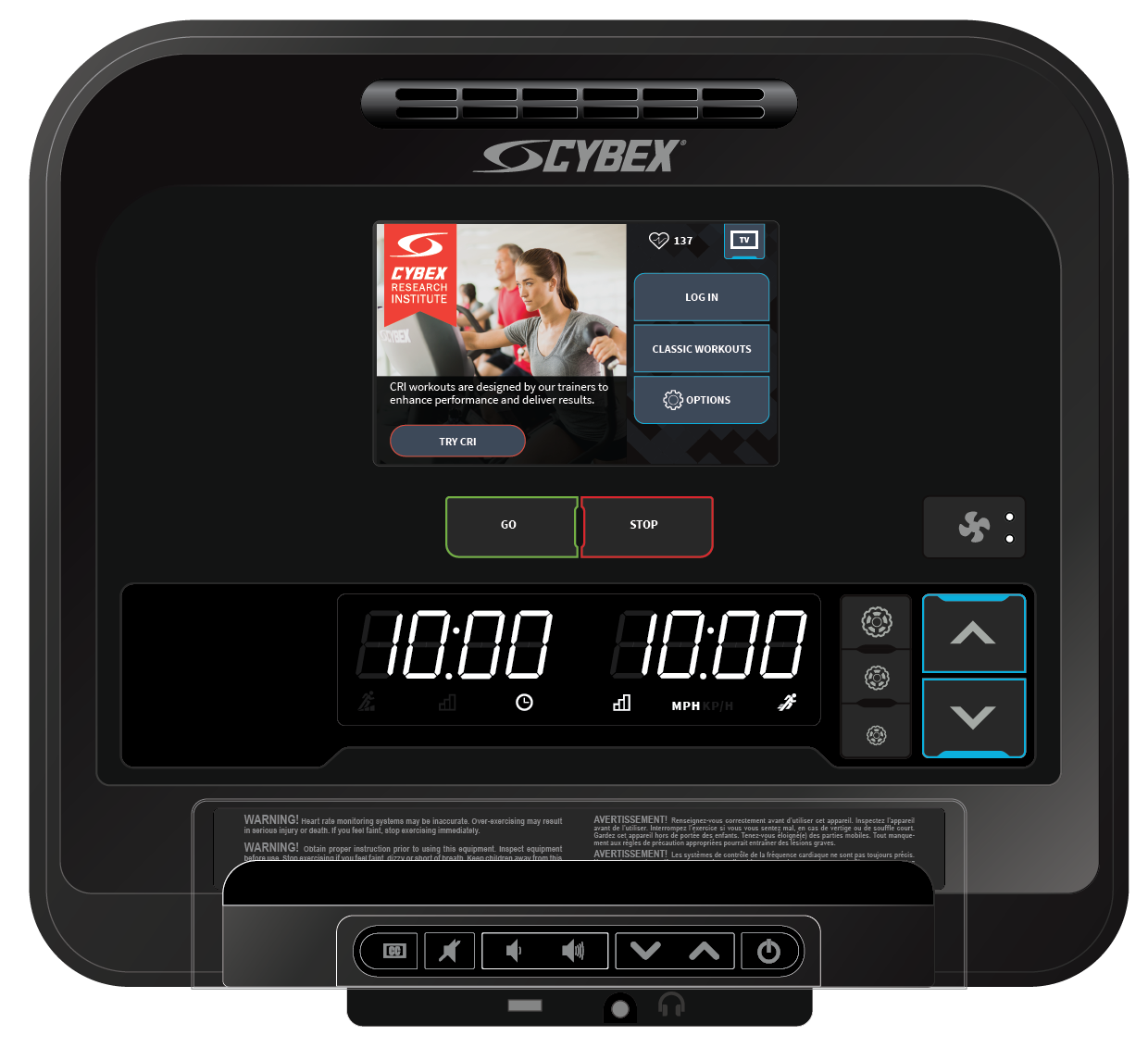
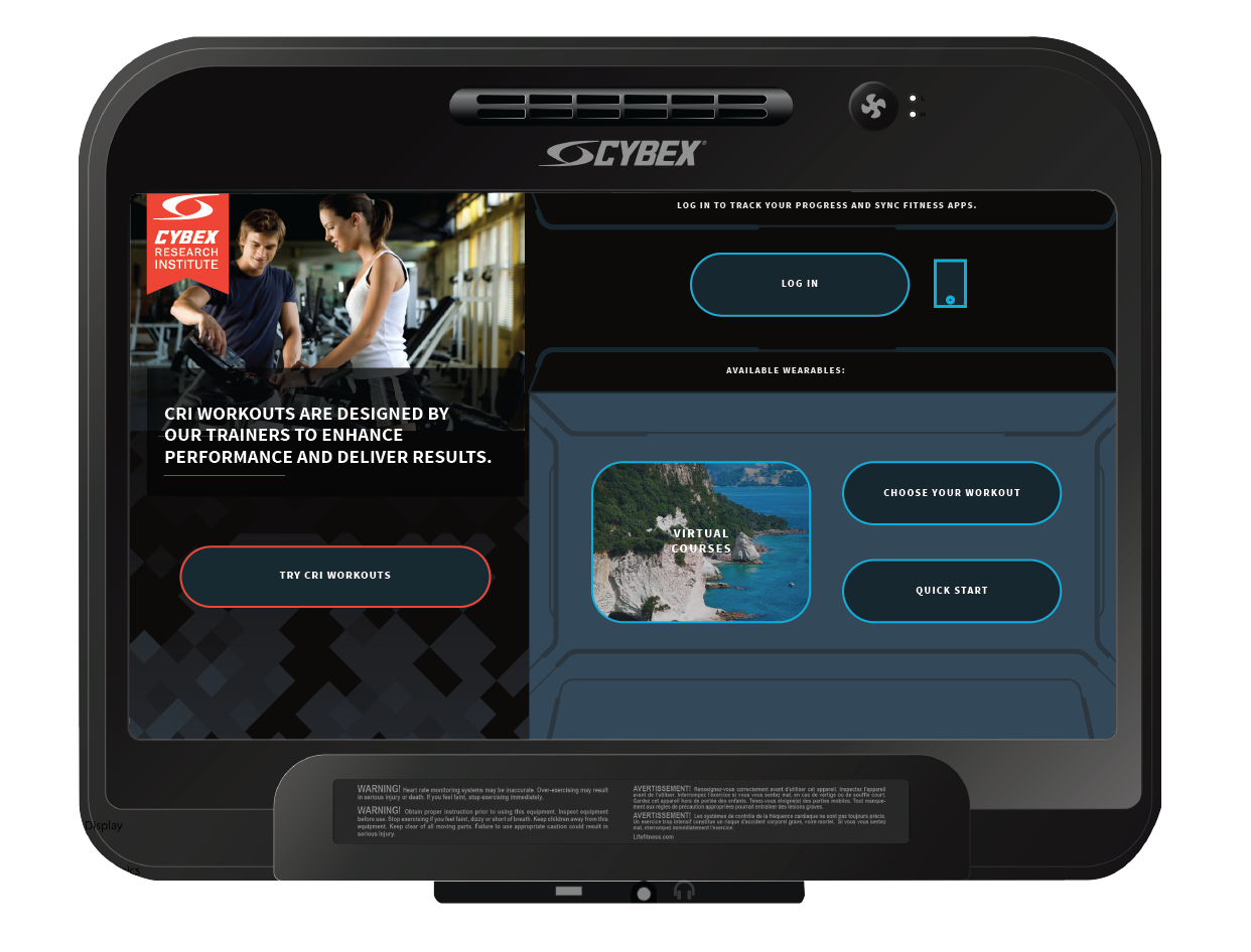
Cybex Treadmill Console
"A digital exercise experience for the modern-day athlete"
Cybex International is a fitness equipment company based in Rosemont, IL under the parent company, Life Fitness – one of the global leaders in commercial exercise equipment. Cybex enlisted the help of designers to assist with a massive brand refresh for their upcoming new line of treadmills to cater to high-performance exercise enthusiasts and gym owners. I was hired on as the lead UX and UI Designer for the mid-tier machines.


The Challenge
The challenge was to combine two of the company’s exercise treadmills, using one as a visual model, and the other as the architectural foundation to redesign Cybex’s mid-tier cardio treadmill as part of their product relaunch. Since Life Fitness’s SE3 treadmill had proven to be successful in the exercise industry, I used data analytics to focus on problem areas of the machine such as data visualization, workout logic, and finding a happy path to complete a workout without disruption.
Role: UX Designer | UI Designer
Timeline: 6 months
Tools: Pen & Paper, Post-Its, Axure, Adobe CC
Deliverables: Low Fidelity Prototype, High Fidelity Comps, Brand Style Guide
Target Audience: Fitness Enthusiasts
Project Kickoff + Research
I was responsible for designing Cybex's mid-tier T2 console, in which I leveraged existing user research that followed users in their day-to-day training journies. This data helped to understand business insights, measure KPI, and frame my user research questions.
Key Business Goals
- Challenge exercisers by providing pre-formatted workout options based on each individuals level - beginner, intermediate, and advance.
- Visually differentiate from competitors by absorbing Cybex’s color palette.
- Attract new and existing users to promotional CRI workouts upon at launch.
- Use responsive design, best practices to maintain visual aesthetics and scalability.
- How might we make the best use of screen real estate on a 7-inch console?
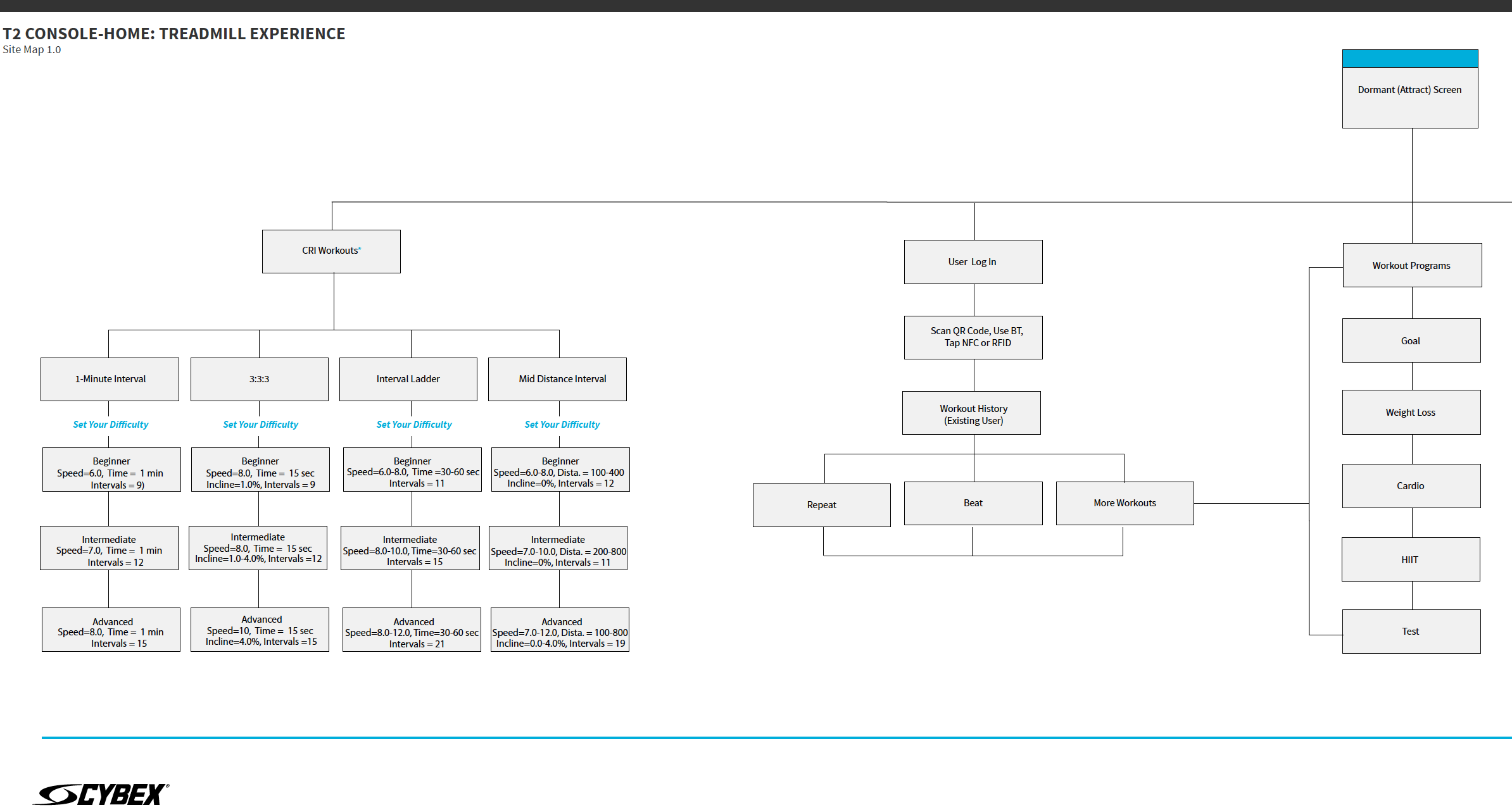
I did some contextual analysis and self-experimenting by hopping on one of the older treadmill models. I was able to get a better understanding of the workout logic behind the system. I then created a sitemap to map out the end-to-end user flow beginning with the most utilized workout - HIIT (High-Intensity Interval Training).

Prototype and Usability Testing
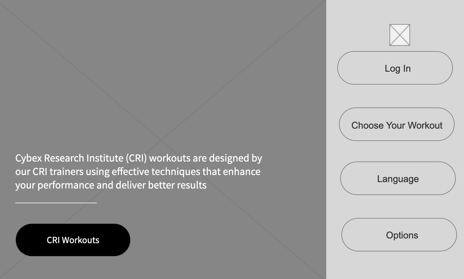
The next phase included conducting a usability analysis with a clickable prototype using Axure RP with Life Fitness employees. The goal of this research effort was to discover the strengths and opportunities of the prototype console model before moving into the design phase. A “think aloud” methodology was performed by having participants’ carry out specific user tasks and scenarios while being observed by the usability tester. This was also a good time to move up the fidelity and incorporate Cybex's workout programs.

Participant Profile
- 2 females.
- 3 males.
- Time: 1-on-1, 15-minute session.
- Familiarity with Cybex Products – All participants were familiar with Cybex exercise equipment but had limited knowledge about the T2 platform.
- Technology Usage - All participants owned multiple devices, including laptops, desktop computers, smartphones, or tablets.
Key Findings
- Language Needs a Visual Call-Out – Users had difficulty changing the language on the Attract/Home page to English because there are no visual indicators to point them in the right direction.
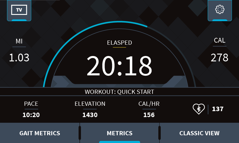
- Metrics Tab vs. Clickable Metrics – When asked where would you go to view all metric status updates? An overwhelming number of participants selected the metrics tab in the bottom navigation bar. Users did not know that the left-hand metrics were clickable, but skipped over this, then selected the most visible option -“Metrics.” Affordance should be established to let the user know there is an additional level of interactivity onscreen.
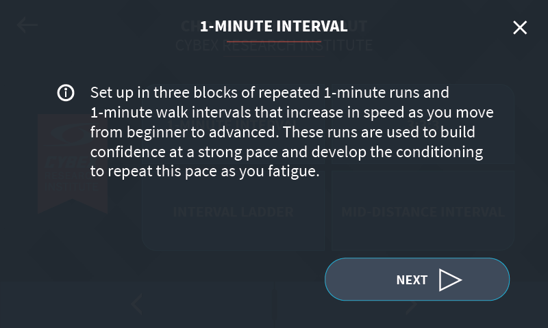
- CRI Workout Setup Instructions – Users experienced confusion with CRI workout setup and had trouble understanding the data points for work/rest periods. Additionally, questions were raised on whether it was a time or distance-based workout, how long would the workout last, and an option to customize the beginning speed.
Design Workshop
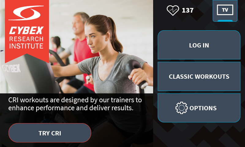
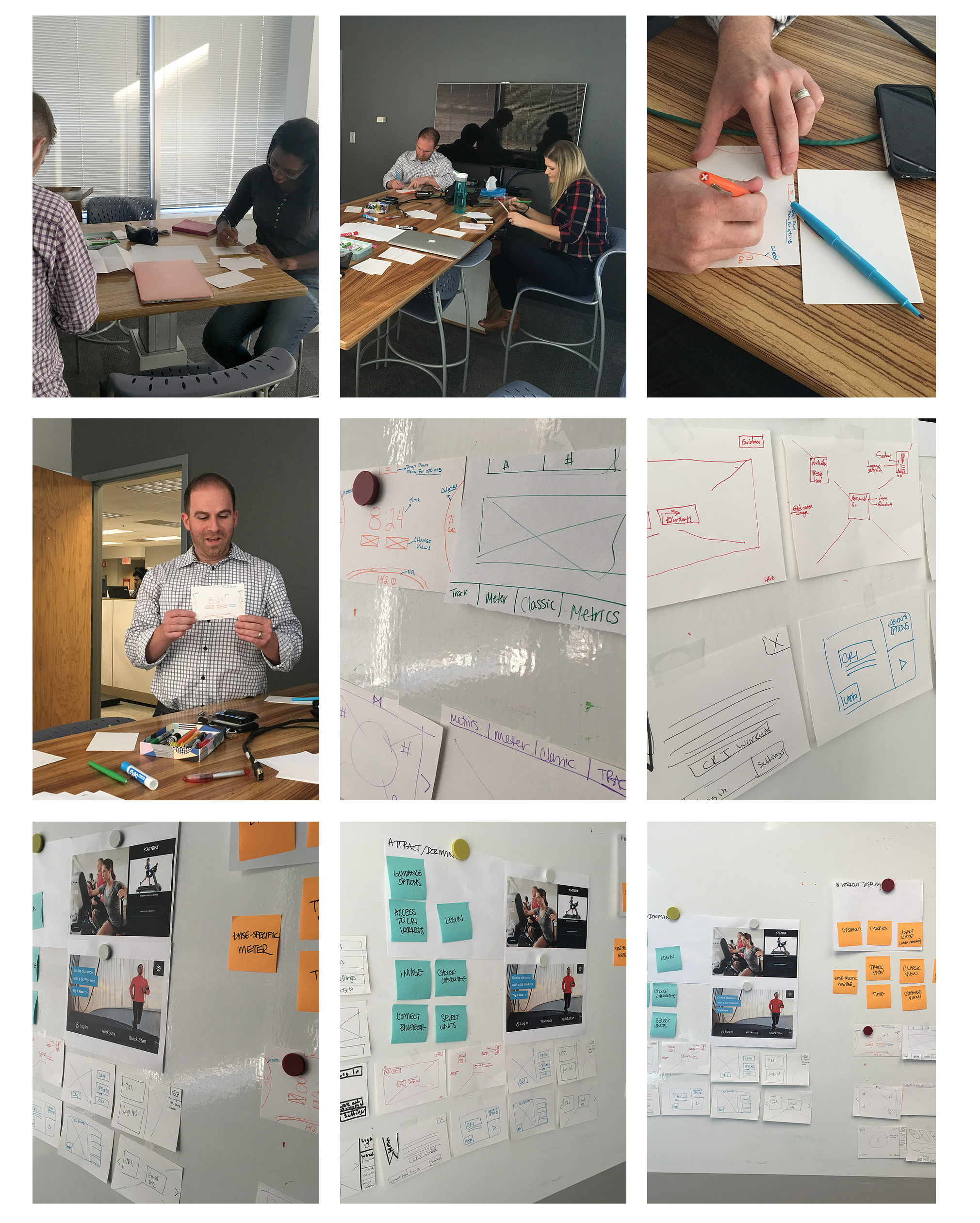
I got an opportunity to facilitate a design workshop and enlisted the help of some of the most creative minds around the company. Since screen real estate was limited, I decided to hone in on the home screen to ensure value proposition for Cybex's CRI workouts and also come up with as many solutions possible. CRI workouts stand for Cybex Research Institute. As I mentioned earlier, these workouts represent various HIIT programs available on the treadmill machine.

List of Must-Haves
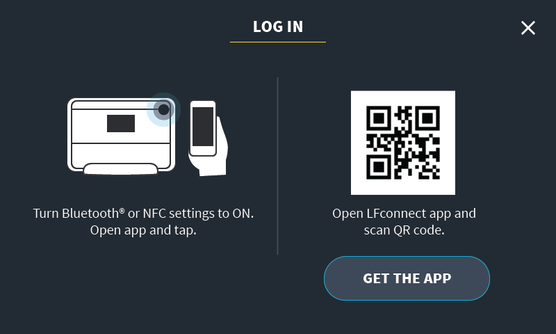
- Sign In
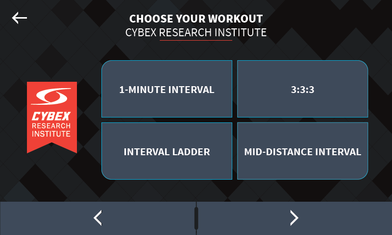
- CRI Workouts
- CRI Workout Description
- Standard "Choose Your Work" Options
- Language

Workshop Results
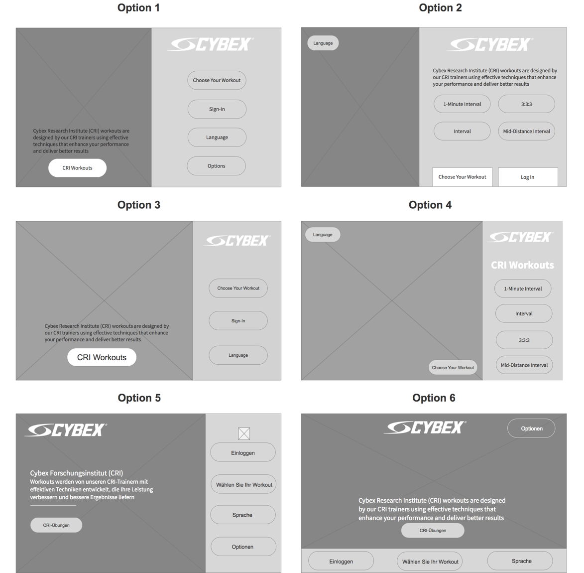
After several rounds of iteration, we had a total of six different options. Ultimately, we chose option 3 as the winner for the newly minted console.
Style Guide + Visuals
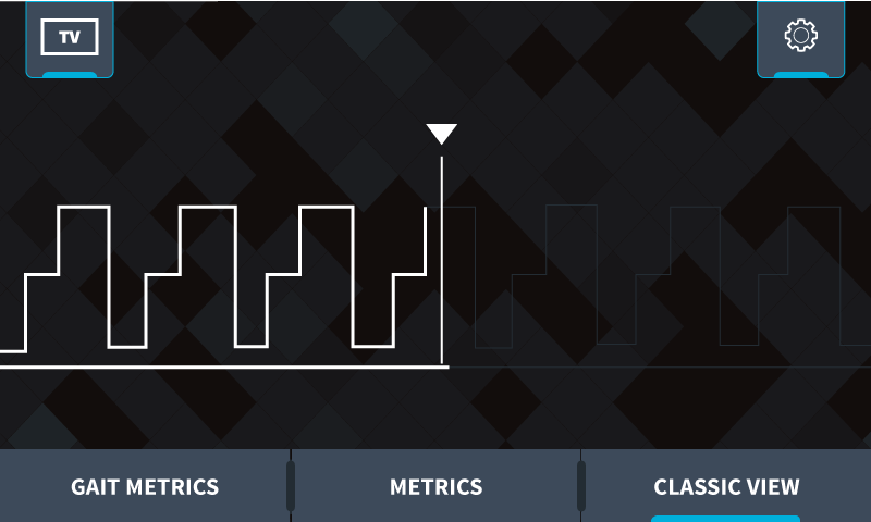
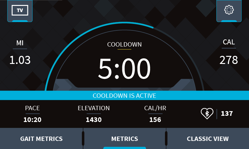
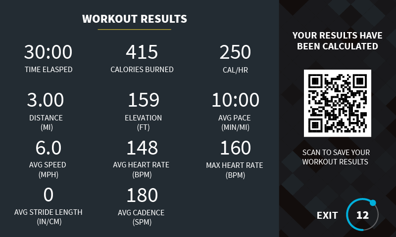
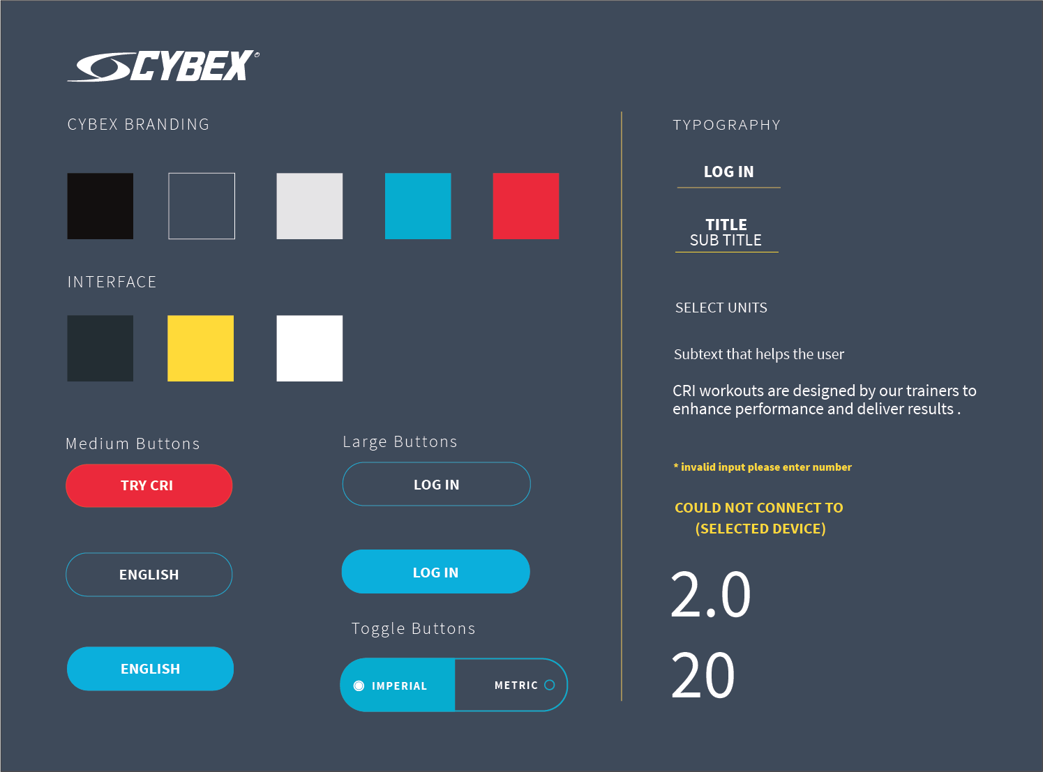
I worked with the industrial design team to detail out the final pieces of the style guide and drawing inspiration from the physical cardio equipment itself. We aimed to maintain Cybex's edge for design with their aggressive and sleek patterns. So we ideated on different variations for button styles, typefaces, precision lines, and shapes that best matched the brand's message and incorporated them into the UI.
Style Palette Guidelines
- Bold, light, and large typefaces
- Precision lines
- Clear default and active press states
- Contrast colors

Final Design

